Hello Odooers & Developers!
Welcome to this Odoo technical article, where I'll discuss the different default widgets in Odoo, their purpose, and their implementation syntax.
Widgets in Odoo are powerful tools that allow developers to customize how fields appear and behave in the user interface. They contribute towards enhanced user experience by providing specialized input controls, improved data visualization, and richer interaction patterns.
In this article, we’ll cover:
- What widgets are and why they are helpful
- Various kinds of widgets in Odoo
- Real-life examples of popular widgets used
What are Widgets in Odoo?
Widgets in Odoo are special tools that control how data is displayed and interacted with in forms, lists, and other views. They help make the system easier to use and improve the way users enter and view information.
Why Are Widgets Useful?
1. Making data entry easier: A few widgets offer dropdowns, checkboxes, or date pickers so that users do not have to enter everything manually.
2. Improving how information looks: Widgets help present data more organized and clearly. For example, a progress bar can show task completion instead of just a number.
3. Adding interactive features: Widgets allow users to upload files, pick colors, sign documents, and more, making Odoo more powerful and flexible.
Types of Widgets:
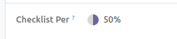
- The percentage pie chart: widget takes a numeric value and represents it as a visual, circular chart displaying the completion percentage. Instead of showing a number alone, it shows it within a circle filled to the extent of the percentage value.
The widget takes a numeric value (like 50) and turns it into a pie chart, where the filled portion of the circle represents the percentage value.
- For example, in your XML view, you can easily display a Percentage Pie Chart by using:
<field name="completion_rate" widget="percentpie"/>
- Status Bar: The status bar widget presents field values in the form of a step-based progress bar. It does not display plain text but rather summarizes each phase of a process in a way that makes the present stage stand out. For instance, a process can have phases such as "New," "In Progress," and "Done." The highlighted present stage helps one quickly identify where they are within the process.
- For example, in your XML view, you can easily display a Status Bar by using:
<field name="state" widget="statusbar" />

- Many2many Checkboxes: The Many2many Checkboxes widget lets users choose multiple values at once by displaying each option as an individual checkbox. This makes it clear which items are available for selection and allows users to check or uncheck the boxes to add or remove items.
- For example, in your XML view, you can easily display a Many2many Checkboxes by using:
<field name="tag_ids" widget="many2many_checkboxes"/>

- Progress Bar: The progress bar widget visually shows how much a task is completed by filling a bar according to a percentage. Rather than simply displaying a number (such as 50%), it converts that value into a graphical bar so users can immediately understand the progress.
<field name="progress" widget="progressbar"/>

- Many2many Tags : The Many2many Tags widget displays many-to-many field values as rounded, clickable tags. This makes it visually appealing and easier for users to see and manage multiple selections at once.
<field name="tag_ids" widget="many2many_tags"/>

- Handle (Drag & Drop) : The handle widget makes it possible to reorder records quickly by dragging them up and down in tree form. You use this widget if you want to reorder items within a list in terms of priority or according to a customized order. Simply apply the attribute widget="handle" to the field (which should be a sequence field) of your XML view.
XML View (form view):
<field name="sequence" widget="handle"/>

In this example, the sequence field is displayed with a drag handle. Users can click on the handle and move the line up or down to reorder the list items.
- Many2many Binary (File Uploads) : Many binary fields let you upload files and even see a preview of them. This widget works only for binary fields. To use it, you define a Many2many field that links to attachments (usually in their. attachment model) and then use the widget in your XML view.
Python Model(models.py):
images_ids = fields.Many2many('ir.attachment', string='ADD')
XML View (form view):
<field name="images_ids" widget="many2many_binary" >

- Radio Buttons: The radio widget in Odoo lets you show all choices as clickable buttons instead of hiding them in a dropdown. This way, users can see all options at once and easily pick the one they want.
Python Model(models.py):
gender = fields.Selection([('male', 'Male'),('female', 'Female')], string="Gender", default='male')
XML View (form view):
<field name="gender" widget="radio"/>
- This will display two radio buttons labeled "Male" and "Female". The user simply clicks one of the options to make a selection.

- Priority (Stars) : The priority widget in Odoo is an easy method of demonstrating how urgent or important a task is through stars. Rather than presenting plain text such as "Low" or "High," it translates these tags into a star rating so that it can be easily recognized at a glance which tasks are of higher priority.
- For high-priority tasks, for instance, the widget could represent three stars, and one star for "Low" priority tasks. The visual feature makes it possible for users to immediately grasp and deal with tasks without having to read extensive content.
Python Model (models.py)
priority = fields.Selection([('low', 'Low'), ('medium', 'Medium'), ('high', 'High'), ('very_high', 'Very High')], string="Priority")XML View (form view)
- Toggle Button : The boolean_toggle widget converts a Boolean field into a toggle switch, making it easier to enable or disable options.
- Use the code widget="boolean_toggle" to get the button effect.
When to Use boolean_toggle :
- Ideal for settings like "Active / Inactive", "Enable / Disable", or "Show / Hide".
- Improves UX compared to standard checkboxes.
- For example, in your XML view, you can easily display a toggle button by using:
Python Model (models.py)
<field name="priority" widget="priority"/>

class YourModel(models.Model):
_name = 'your.model'
is_active = fields.Boolean(string="Active", default=True)
- XML View (form view)
<field name="is_active" widget="boolean_toggle"/>

- Html: The HTML widget in Odoo allows you to display and edit content with rich text formatting. This means that rather than using a plain text box, you get a visual editor where you can see the formatted content as you create it. With this editor, users can format text, add images, links, and more—all without knowing HTML code.
<field name="content" widget=”html”/>

Conclusion
Odoo widgets make your application interface clearer and easier to use. They turn plain data into visual, interactive tools. For example, progress bars and pie charts instantly show task completion, while checkboxes and tags let you quickly select multiple options. Widgets like the handle let you drag items to reorder them, and boolean_toggle changes a checkbox into an attractive switch. Together, these features simplify how users work with the system without handling complicated code or many steps.
If you want odoo technical training on any odoo version , please let us know by mail at [email protected]. Then next, our odoo expoert will conduct online or offline training with you
Devintellecs & team are odoo training providers in the USA and INDIA, so we will try our best to give the training either individal or any bulk employee company.
If you want to check your odoo technical or functional knowledge, then we have prepared the odoo EXam practice test for the odoo technical & functional people.

How to Create Widgets in Odoo